MacWeb is a cloud platform that gives developers access to real Mac hardware on demand. Under the hood, it’s serious infrastructure built to scale - but on the surface, it needs to feel approachable and easy to use, especially for smaller teams. The brand had to communicate both: enterprise-grade power and a setup that doesn’t get in the way of shipping.
Goal:
Create a scalable visual brand that feels fresh, distinctive, and clearly different from other infrastructure providers. MacWeb needed a brand that could grow with the product - not something decorative, but a system that works across product, marketing, and sales without falling apart as new services are added.
Challenges:
- A wide range of services and solutions that could easily start feeling like a “catalog” if presented the wrong way
- Very technical infrastructure that needed to communicate scale and seriousness
- Showing real hardware and real capability without slipping into stock imagery or visuals that feel cheap or generic
What we did:
- Built all product visuals in 3D instead of relying on photography, which gave us full control and long-term flexibility
- Designed a full visual system around those assets - colors, geometry, typography, patterns, icons - so everything works together
- Created a set of unique, ownable visuals that MacWeb can reuse and extend as the product and company grow
Project Highlights:
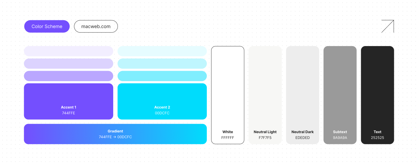
We kept the palette tight: two accents, a gradient, and a neutral scale. Most infrastructure brands stay inside the same blue-and-gray zone, so the first decision was getting MacWeb out of it. Violet carries the personality, cyan keeps things technical, and the neutrals stay quiet so UI, 3D renders, and documentation all have room to breathe.
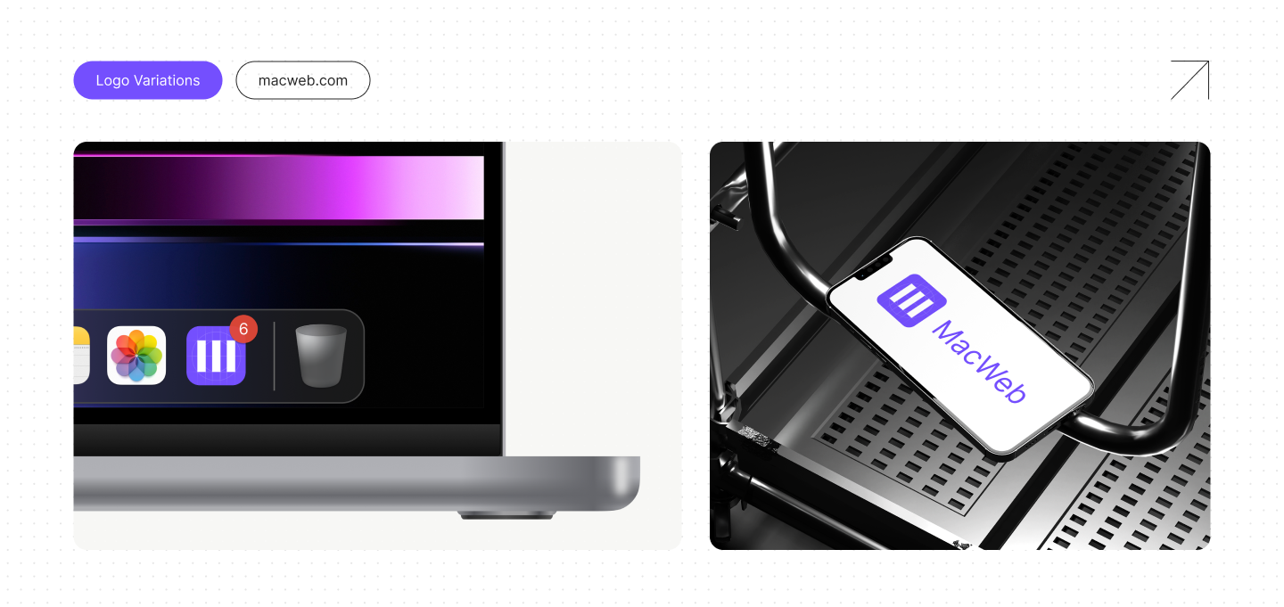
The mark does two things at once. Read it one way and it's an M for MacWeb. Read it again and it's a server rack with three Mac units stacked inside, which is basically what the platform is under the hood. It's a logo that tells you how the product works without having to explain itself. From there, we built variations for the contexts the brand actually shows up in: an app icon on a dock, a full version for webpages and decks, plus greyscale and vertical lockups for the awkward in-between cases.
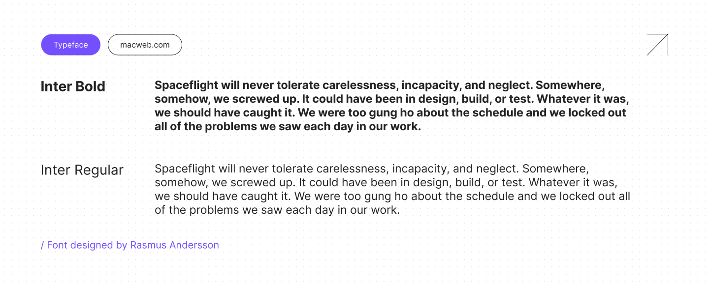
Inter does the job. It's clean, reads well at every size, and has enough character to not feel generic, which is all we needed from a typeface on a product this technical. Two weights cover the whole system: Bold for anything that needs to pull focus, Regular for everything else. Keeping it to two weights also keeps the hierarchy honest, since nothing gets emphasis unless it actually earns it.
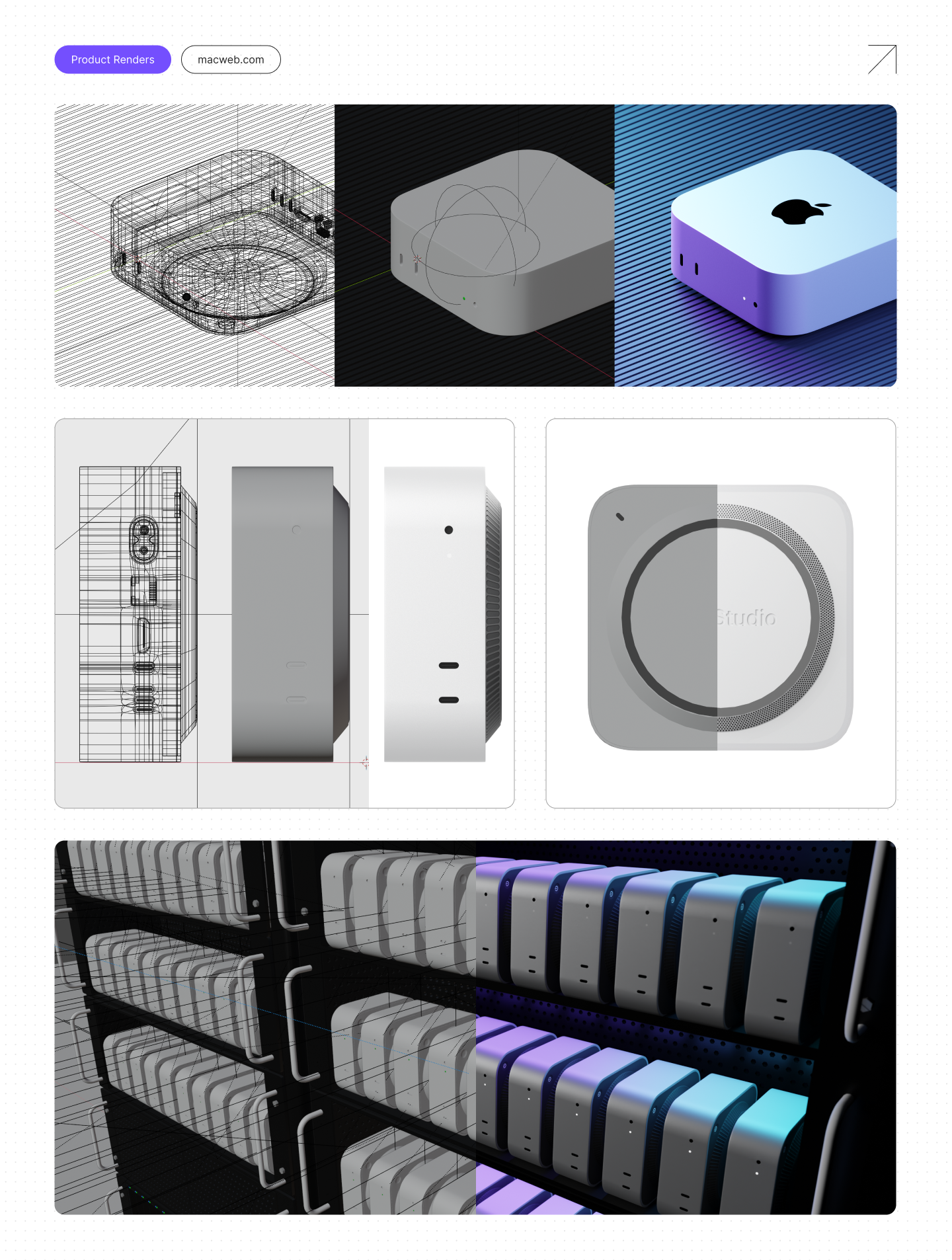
Every render is built from scratch in 3D. No stock photos, no product shots pulled off the internet. That gave us two things: full control over how the hardware sits in the frame, and room to push visuals somewhere more expressive when we want to. The system splits into two modes. Clean, photoreal shots for product pages and spec sheets, where the hardware needs to look like itself. Moodier, gradient-lit compositions for marketing and social, where the hardware is a starting point and the mood is doing most of the talking.
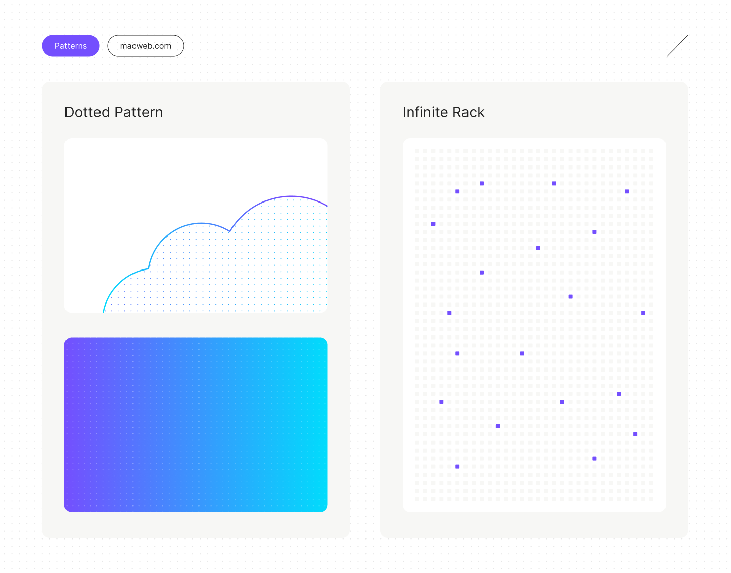
Two patterns do most of the background work. The dotted grid is the quiet one: it sits behind renders, gradients, and dense layouts to add texture without pulling focus. The Infinite Rack is the loud one, a field of Mac units stretching off in every direction that makes the scale of the platform obvious the second you see it.
Results:
- A visual brand that feels solid, modern, and clearly differentiated in a crowded infrastructure space
- A system that scales seamlessly while maintaining an engaging presentation of solutions and services
- Brand assets the team can confidently reuse across product, website, decks, and future launches
A word from the client

Eric Bickford
CEO, MacWeb
Working with Launch Deck felt very natural. They really took the time to understand both the technical side of MacWeb and how we want developers to experience the product. The result feels true to what we’re building - powerful, but simple and approachable on the surface. It finally looks like a brand we can grow with.