ODDP is a senior product and engineering consultancy that works with teams facing complex product and technical challenges. Their focus is on thoughtful decisions and long-term outcomes, rather than quick fixes or feature-driven delivery.
Goal:
Create a website that reflects the way ODDP actually works - measured, considered, and outcome-focused.
Challenges:
- Much of ODDP’s value sits in experience and judgment, which is difficult to express online
- Their work spans strategy and execution, without fitting neatly into standard “service” buckets
- The site needed to feel credible and calm, without drifting into generic consulting language
What we did:
- Worked closely with the founders to understand how they approach problems and make decisions
- While we didn't work with wording, we still shaped a clear top-level narrative around outcomes, responsibility, and long-term thinking
- Designed a restrained visual system that supports the content rather than competing with it
- Collaborated with developers through iterations to ensure clarity, consistency, and responsiveness
Project Highlights:
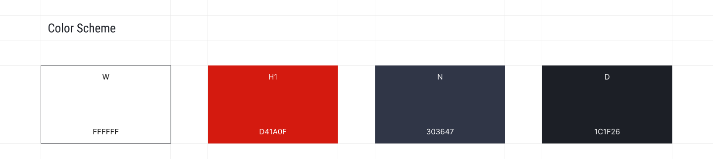
The color palette is simple and deliberate, with plenty of whitespace to let the content breathe. White creates clarity, dark tones add seriousness, and red is used only when something really needs attention. Nothing decorative - just colors that support focus, trust, and readability.
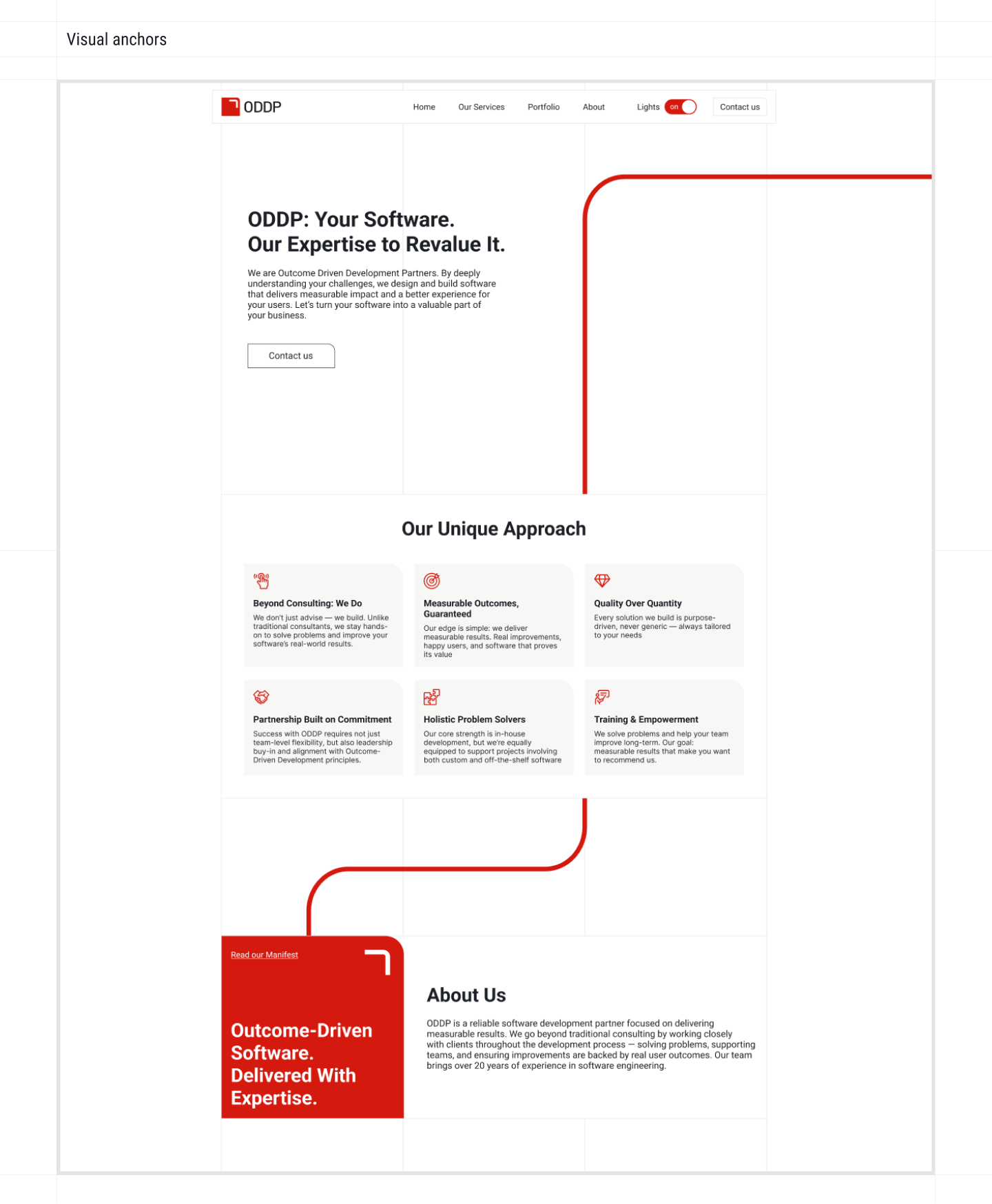
We added visual anchors to guide people as they scroll. The repeated red elements and connecting lines act as reference points that tie sections together and show how the story flows. It makes longer pages easier to follow and gives the layout a clear sense of direction.
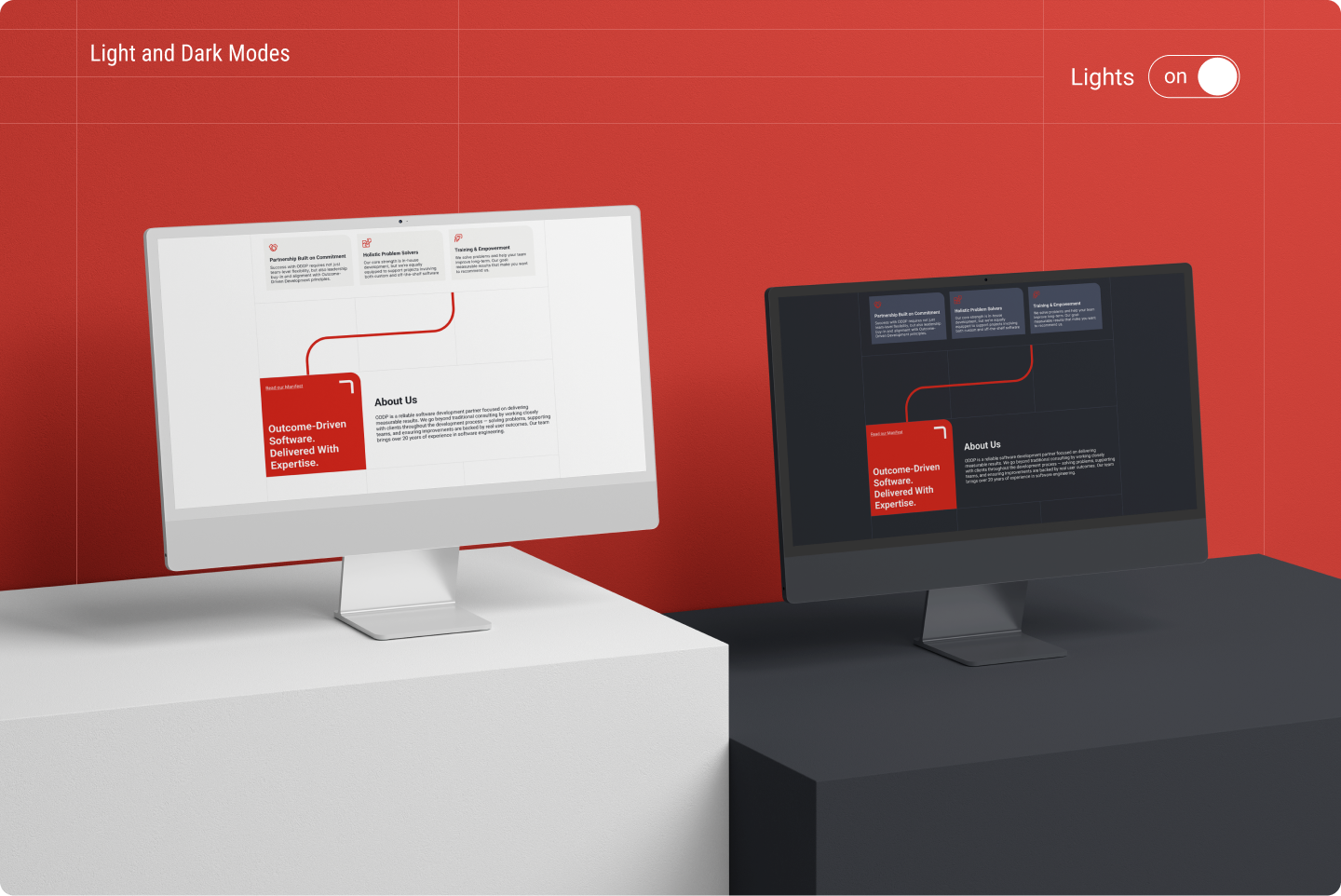
We added a light and dark mode switcher so the site works better in different situations. Both modes were designed properly, not just inverted, and the content stays clear and readable in each. It gives people a choice without changing how the site actually works.
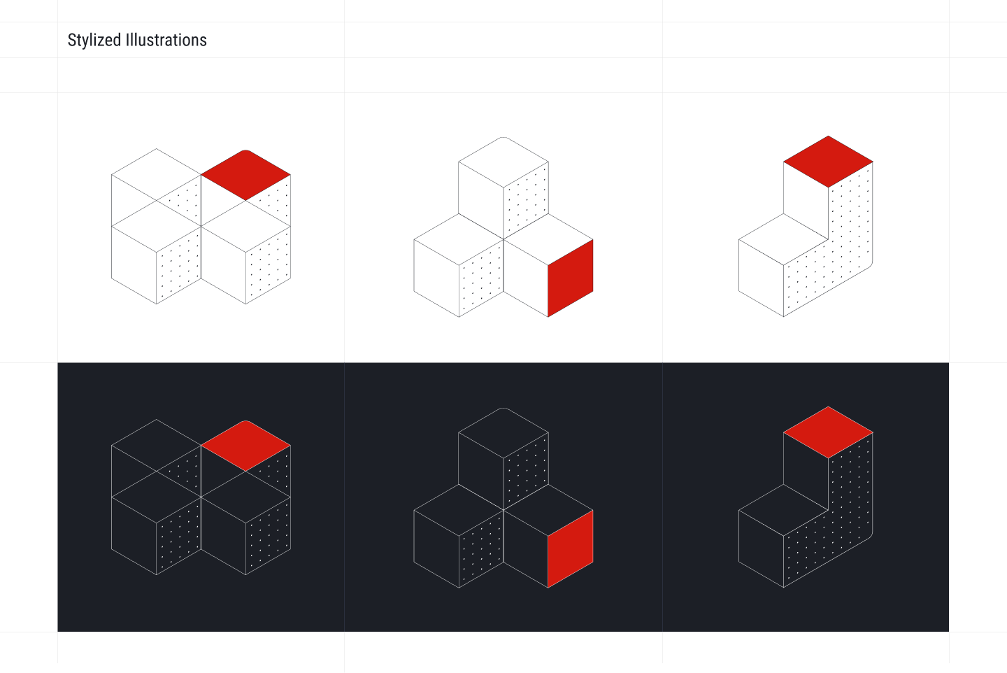
We built the illustrations in-house to help explain things visually, not to decorate the page. They’re simple, structured, and repeatable, using the same shapes and accents throughout the site. This keeps everything consistent and makes the content easier to follow without distracting from it.
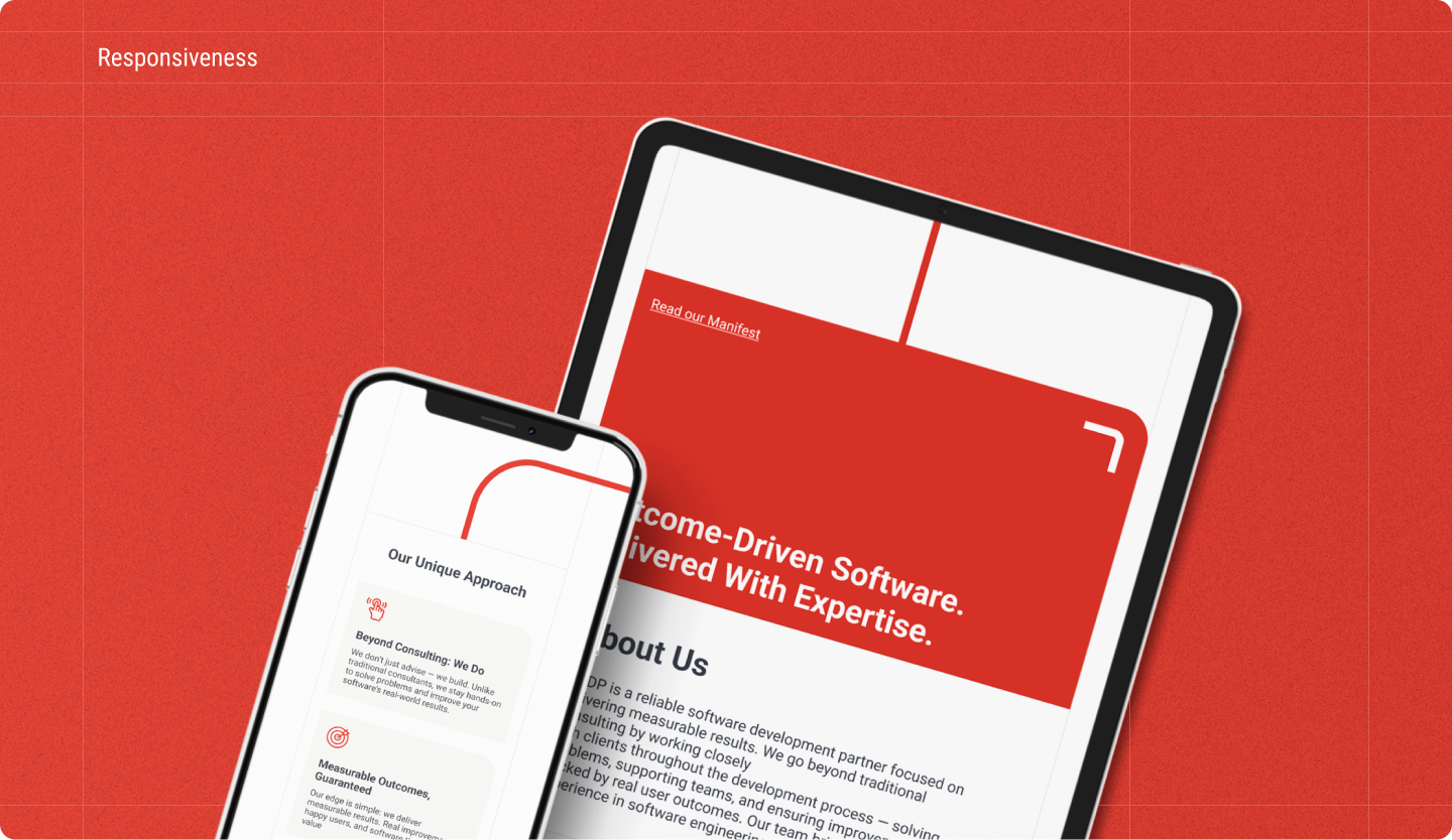
We made sure the site works on smaller screens, not just technically but structurally. Even the more complex grid layouts were adapted, not flattened or broken. The content stays readable and the logic holds up, whether you’re on a phone, tablet, or desktop.
Results:
- A website that clearly communicates ODDP’s approach without overstatement
- Stronger alignment between how the team works and how they present themselves online
- A foundation that supports future growth, case studies, and thought leadership
A word from the client

Oleg Anisko
Founder, ODDP
Very pleased with Launch Deck. They listened carefully, challenged us in the right places, and helped us put into words what we usually only explain in conversations. The website finally feels like us, and we’re happy to point people to it without having to add extra context.